
InDesign Portfolio
Click the quick links below to jump to my different projects. For a larger view of each design, simply click the image!
Sawdust Festival Hollywood Restaurant MenuThe Humane Society Calendar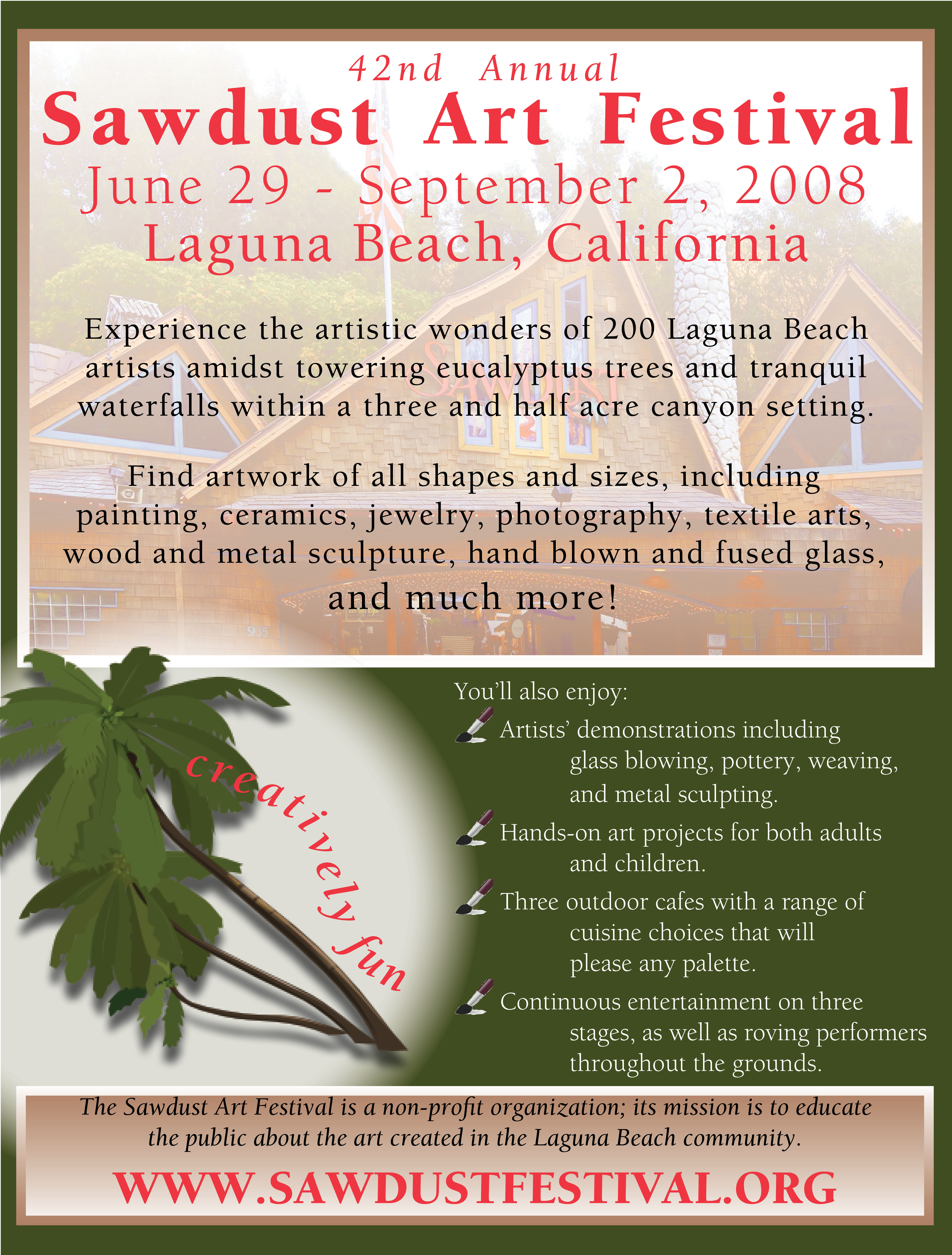
When creating this project, I prioritized the maintenance of the branding and general look of the Sawdust Festival to meet the client's needs. After looking at the Festival's website, I used the eye dropper tool to pull the exact colors from the main buildings and word mark and use these colors in the creation of the flyer. Because my client was please with my previous work, I definitely took inspiration and techniques from the Miami Jazz Festival flyer.
I wanted to use clear, natural graphics to mimic the location of the festival. I chose the graphic of the Sawdust main building to feather into the background of the flyer because it will be recognizable for people who have been to the festival and the structure is very elegant and artistic, giving the festival credibility. I chose to feather this image because the necessary information about the festival can be seen while also providing a compelling visual element. I also chose to use an image of a palm tree because although the Art and Craft Festival evokes a natural, forest feel, Laguna is a tropical climate with nearby beaches. Beaches could be a major attraction for travelers looking in magazines like the WestWays from AAA, which is one of the target audiences for the Sawdust Festival management, driving tourists to coordinate their vacations around the event. This imagery also addressed my art director's comments, which is another of my priorities when working on a project.
I chose a slim font to continue the clean, crisp feel of this festival, but opted for the bold version to ensure that the text would be visible on the tan background. I used the justification and kerning adjustments to space the large titles in the flyer well. I struggled to get all of the text that the client wanted onto the flyer, but I focused on using a variety of text boxes, character spacing, and font size.
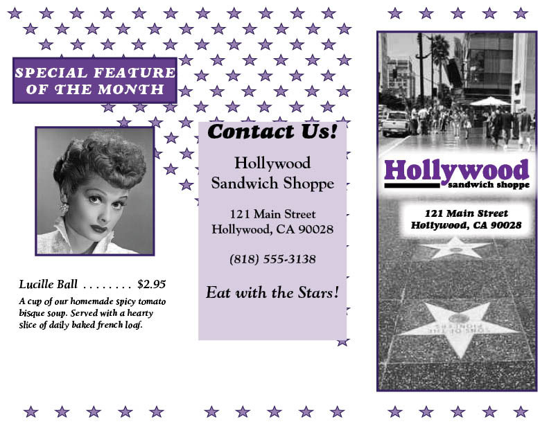
With this design, my main focus was to choose a layout and color scheme with a high contrast. This client will need to reprint this menu monthly and color printing could get pricy. By using a large amount of white space and a dark purple as the accent color, there will be no problems with printing in either black and white or color.
I really enjoyed the tri-fold layout that we created for the Chapter 4 project, so I utilized the template that I had already created. This way all of the formatting and folding indications were already present, saving me some time. However, I created different styles within this template to make sure that my two designs were distinct.
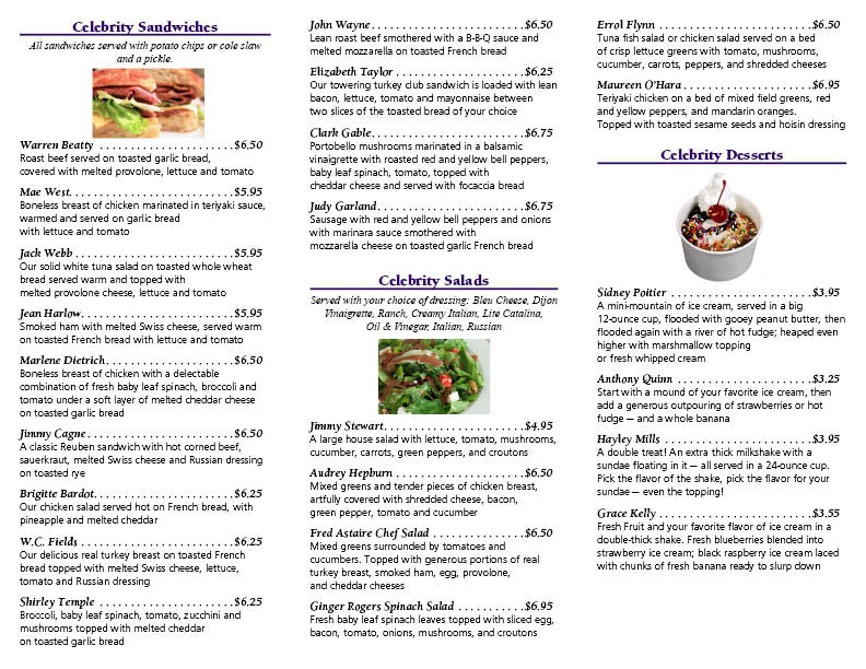
To improve my consistency, save time and edit more easily, I used paragraph styles throughout the menu listing of items. I kept the text color a simple black and manipulated font styles and sizes to improve readability of this text heavy document. I included small images of food to relate back to the company's purpose and to be reminiscent of the time period. Per the client's request, I included a "special of the month" panel and use place holders to illustrate the layout. I maintained the theme of the restaurant for this panel.
For the front cover image, I manipulate a photo from Flickr. By using photos from this website, I have helped the client to avoid all copyright issues and pay any extra fees. I copied the image into Photoshop and used various effects to improve the contrast and put the image into black and white.
To achieve the star pattern on the back side of the menu, I used a tool that we learned in class, "step and repeat". This tool allowed me to create rows of diagonal stars with very little error in spacing and in a very short amount of time. Another way that I avoided spacing issues was by using the tools in the align panel. This ensured that my graphic and text boxes were evenly distributed to the selections.
I am happy with my menu, but would like to ask the client if there is any more text that they would like on the back panel and the inside folding panel. I feel that it could be used more wisely by inserting coupons, promoting sister restaurants, or an area for comments from patrons.
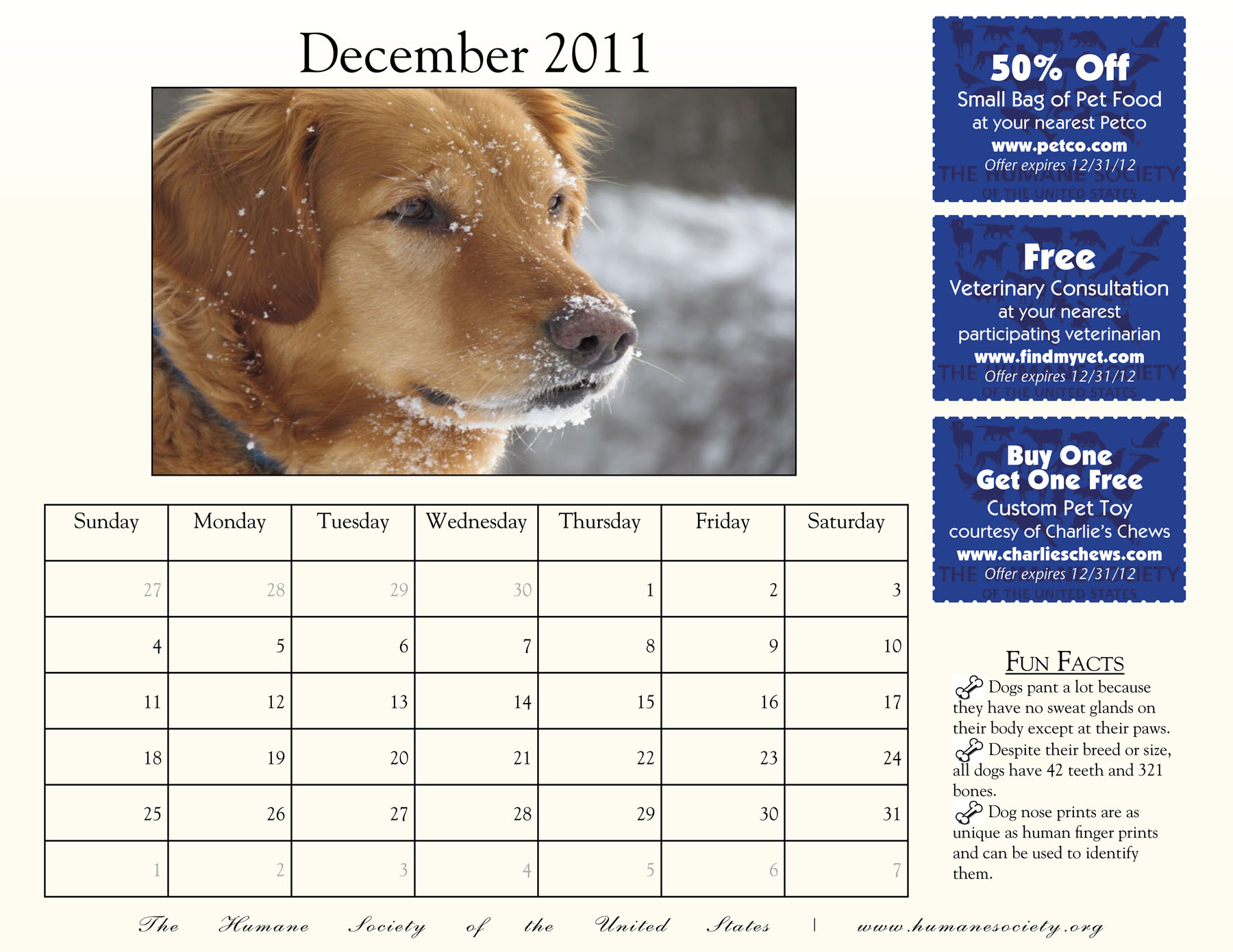
For this project, I realized the benefit of using a master page to create a template from which I would create the months of the calendar. I chose to use an 8.5" x 11" page because it is the most common. Price was not a concern because the printer had donated the resources to print this job, but I wanted the calendar to be relatively small to allow homes to find the space on refrigerators or corporate executives to find space on their already crowded desks. I was able to find enough space to incorporate all of the elements requested by my client on this page size.
While I understand the overall concept of a master page, I had difficulties applying my changes to the entire calendar after overriding the master page on the individual pages. This became frustrating and time consuming quickly, so if I were asked to use a master page template again, I would definitely need more practice with the tool. I do realize; however, the ultimate benefit of using a master page for large documents after finishing the project with only four pages.
I elected to select images from the website www.flickr.com. These images are completely free of cost to use in the Humane Society's calendar. By using images that do not require a licensing fee, the overall cost of the calendar will be reduced as well as giving amateur photographers free publicity.
Because I had limited space to include all of the visual and text elements requested by my client, I aimed to keep the overall calendar layout and fonts clean and crisp. This is the style that I often use for my projects, but it also applied well to this assignment. I was able to utilize skills that I have mastered in previous projects to enhance my current assignment.